Create and Customize a Reviews Widget
The Reviews Widget feature lets you build a review display widget for your website using your connected reviews.

From the screenshots, this feature supports:
- saved widgets
- widget templates
- multiple widget layouts
- title and header customization
- theme and color controls
- review display settings
- desktop and mobile preview
- website embed code after saving
Where to find it
Open the left sidebar and go to:
Reviews Widget
What you can do on this page
From this area, you can:
- create a new widget
- browse saved widgets
- preview a selected widget
- switch between desktop and mobile preview
- customize the widget in 4 setup tabs:
- View
- Title
- Theme
- Summary
- save the widget
- copy the website embed code after saving
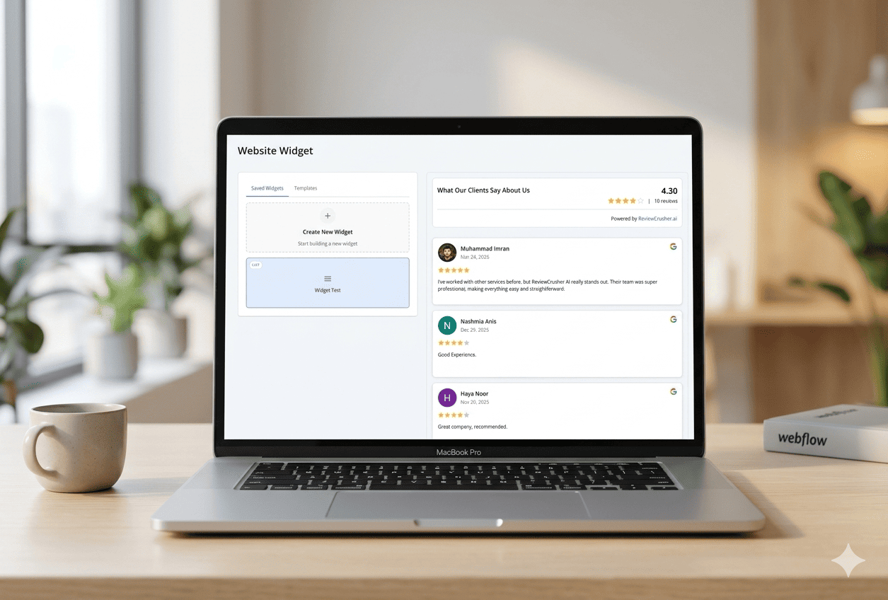
Website Widget home screen

The page title shown in the screenshots is:
Website Widget
The main layout is split into 2 panels:
- left side for saved widgets and templates
- right side for widget preview
Saved Widgets and Templates
On the left panel, the screenshots show 2 tabs:
- Saved Widgets
- Templates
Under Saved Widgets, the page shows:
- a Create New Widget card
- existing widget cards, such as a sample called Widget Test
When nothing is selected, the preview panel shows:
Select a widget to see preview
Create a new widget
To start from scratch, click:
Create New Widget
This begins the widget builder flow.
Select an existing widget
If you already have a saved widget, click it from the Saved Widgets list.
In the screenshot, selecting Widget Test loads the preview on the right.
This lets you continue editing or reviewing an existing widget.
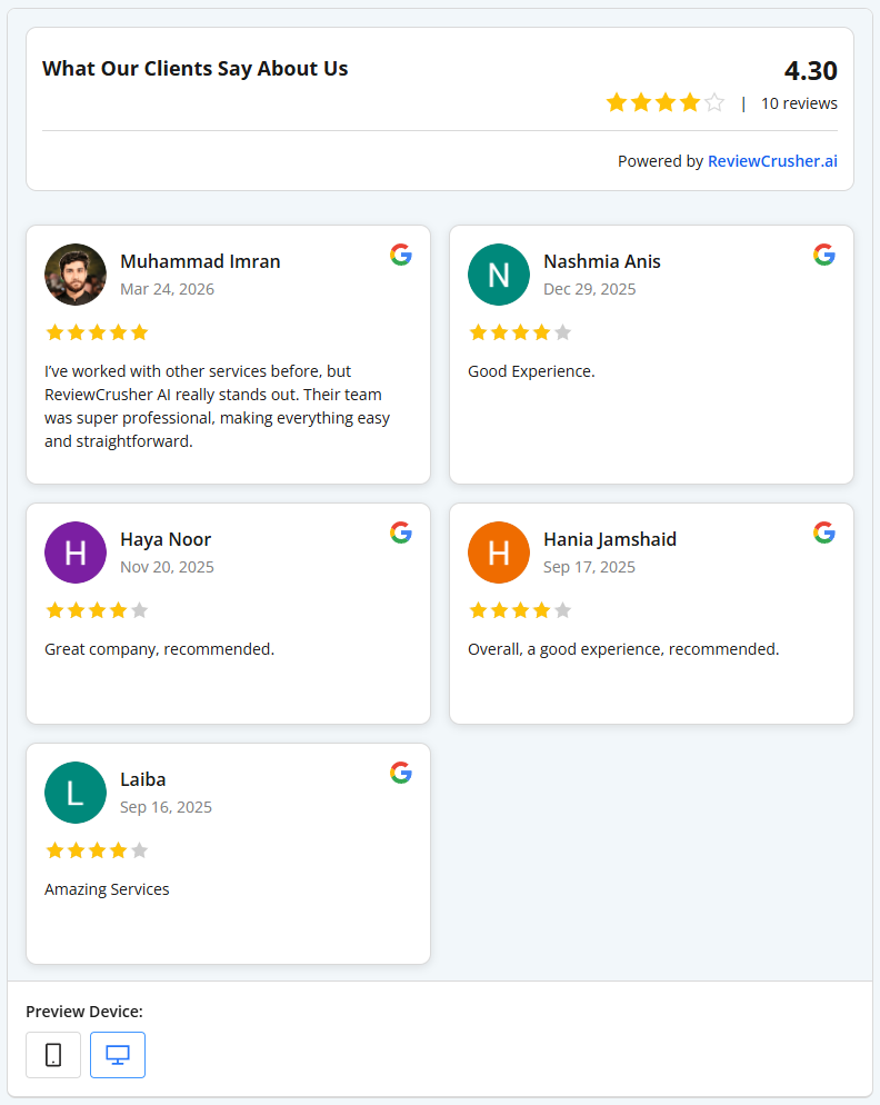
Widget preview
The right panel shows a live preview of the widget as you configure it.
From the screenshots, the preview includes:
- a widget heading
- average rating
- total review count
- branding line:
Powered by ReviewCrusher.ai - visible review cards
- source icons such as Google
- mobile and desktop preview controls
This helps you review the widget before saving or embedding it on your website.
Preview Device
At the bottom of the preview panel, the screenshots show:
Preview Device
with 2 display buttons:
- mobile
- desktop
Use these to switch the preview between smaller and larger screen views.
Widget builder tabs
When editing a widget, the left panel shows 4 tabs:
- View
- Title
- Theme
- Summary
Each tab controls a different part of the widget.
View tab
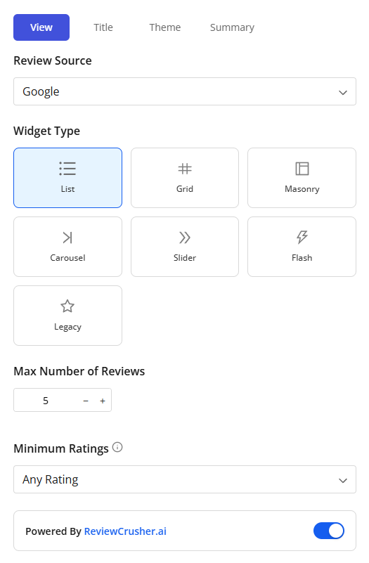
The View tab controls the review source, widget layout, review limits, and visible review feed setup.
From the screenshots, this tab includes the following controls.
Review Source
The first field shown is:
Review Source
In the screenshot, the selected source is:
Use this dropdown to choose the review source for the widget.
Widget Type
The Widget Type section lets you choose the widget layout.
The screenshots show these visible options:
- List
- Grid
- Masonry
- Carousel
- Slider
- Flash
- Legacy
In the screenshot, Grid is selected.
Choose the layout that best fits your website design.
What the screenshot confirms
- the widget type is selectable from visual option cards
- the preview updates on the right based on the selected layout
Max Number of Reviews
The Max Number of Reviews control lets you adjust how many reviews appear in the widget.
In the screenshot, the value shown is:
5
with minus and plus controls.
Use this to limit how many reviews are shown at once.
Minimum Ratings
The Minimum Ratings dropdown controls which ratings are included.
In the screenshot, the selected value is:
Any Rating
Use this to control the minimum review score shown in the widget.
Powered by ReviewCrusher.ai
The screenshots show a toggle labeled:
Powered By ReviewCrusher.ai
When enabled, the widget displays ReviewCrusher branding in the preview.
If you do not want to change this, leave the toggle in its current state.
Add Review
The Add Review button appears in the View tab.
Based on the screenshots, this is a visible action available while building the widget.
Use it when you want to add a review into the widget workflow.
Sync Reviews
The Sync Reviews button also appears in the View tab.
Based on the screenshots, this is a visible action available while editing the widget.
Use it when you want to refresh the widget’s review content from the source.
Review list inside the builder
At the bottom of the View tab, the screenshots show a scrollable review list inside the editor.
Each item appears to include:
- reviewer image or avatar
- reviewer name
- date
- rating
- review text
- source icon
This helps you review the content feeding the widget while you configure it.
Title tab
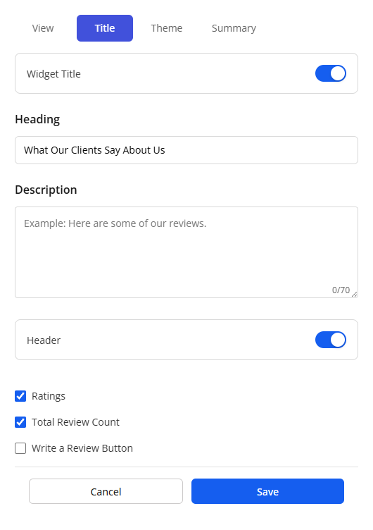
The Title tab controls the visible heading and top summary details of the widget.
From the screenshots, this tab includes the following settings.
Widget Title
The tab shows a Widget Title toggle.
This appears to control whether the widget title section is shown.
Heading
The Heading field sets the main title displayed at the top of the widget.
The screenshot example is:
What Our Clients Say About Us
Use a heading that matches the tone of your website.
Description
The Description field lets you add a short supporting line below the heading.
The placeholder shown is:
Example: Here are some of our reviews.
This field appears optional and can be used to add context.
Header
The Header toggle appears below the description field.
This appears to control whether the widget header area is displayed.
Ratings
The Ratings checkbox controls whether the rating summary is displayed.
In the screenshot, this checkbox is enabled.
Total Review Count
The Total Review Count checkbox controls whether the widget shows the number of reviews.
In the screenshot, this checkbox is enabled.
Write a Review Button
The Write a Review Button checkbox appears in this tab.
In the screenshot, it is not checked.
This suggests the widget can optionally include a review action button.
Save or cancel
At the bottom of the tab, the screenshots show:
- Cancel
- Save
Click Save to keep your title settings.
Theme tab
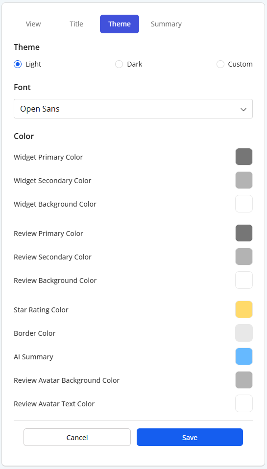
The Theme tab controls the visual styling of the widget.
From the screenshots, this tab includes theme selection, font settings, and detailed color controls.
Theme options
The screenshots show 3 theme choices:
- Light
- Dark
- Custom
In the screenshot, Light is selected.
Choose:
- Light for a bright look
- Dark for a darker design
- Custom if you want to manually control colors
Font
The Font dropdown controls the widget font.
In the screenshot, the font shown is:
Open Sans
Use this setting to match the widget to your website typography.
Color controls
The Theme tab shows multiple color settings.
Visible labels in the screenshot include:
- Widget Primary Color
- Widget Secondary Color
- Widget Background Color
- Review Primary Color
- Review Secondary Color
- Review Background Color
- Star Rating Color
- Border Color
- AI Summary
- Review Avatar Background Color
- Review Avatar Text Color
These controls let you fine-tune the appearance of both the widget shell and the individual review cards.
Use the color selectors to match your brand colors.
Summary tab
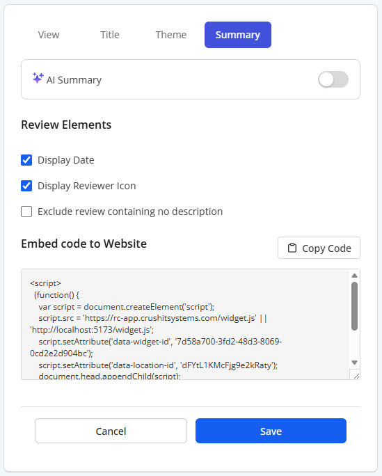
The Summary tab controls AI summary behavior, review display elements, and website embed code.
AI Summary
At the top of the Summary tab, the screenshots show an:
AI Summary
toggle.
This indicates the widget can include an AI summary feature.
Use this toggle if you want the widget to include AI summary behavior.
Review Elements
Below the AI Summary toggle, the screenshots show a Review Elements section with checkboxes.
Visible options are:
- Display Date
- Display Reviewer Icon
- Exclude review containing no description
In the screenshot:
- Display Date is enabled
- Display Reviewer Icon is enabled
- Exclude review containing no description is not enabled
Use these options to control which review details appear in the widget.
Embed code to Website
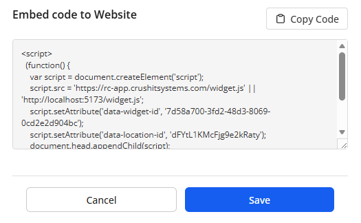
The Summary tab includes a section labeled:
Embed code to Website
This section contains:
- a Copy Code button
- an embed code text box
The text box in the screenshot says:
Embed code will appear here after saving the widget...
This means the widget must be saved before the embed code becomes available.
Copy Code
Use Copy Code after saving the widget to copy the embed code for use on your website.
If the widget has not been saved yet, the embed code area may still be empty.
How to create a widget
A practical workflow based on the screenshots is:
- open Reviews Widget
- click Create New Widget
- in the View tab:
- choose the Review Source
- choose a Widget Type
- set Max Number of Reviews
- choose Minimum Ratings
- decide whether to keep Powered by ReviewCrusher.ai
- in the Title tab:
- set the heading
- add a description if needed
- decide whether to show ratings and total review count
- in the Theme tab:
- choose Light, Dark, or Custom
- choose the font
- adjust colors if needed
- in the Summary tab:
- choose review element settings
- save the widget
- after saving, copy the embed code
- paste the embed code into your website
How to preview the widget
While editing, review the right-side preview panel to confirm:
- the layout looks correct
- the heading appears as expected
- the review cards display properly
- the colors match your brand
- the widget looks good on:
- desktop
- mobile
Use the Preview Device controls to test both views.
Best practices
- choose a widget layout that fits your website section
- keep the widget title short and clear
- use Minimum Ratings carefully depending on the type of reviews you want to show
- review the widget on both desktop and mobile before saving
- save the widget before trying to copy the embed code
- use custom colors only if they improve consistency with your website branding
Troubleshooting
I do not see embed code yet
Save the widget first. The screenshot indicates the embed code appears after saving.
The widget looks too crowded
Lower the Max Number of Reviews or try a different Widget Type.
I want the widget to match my brand
Use the Theme tab to select font and update the color settings.
I want fewer low-rated reviews shown
Change the Minimum Ratings setting.
I want to see how it looks on mobile
Use the Preview Device controls at the bottom of the preview panel.
What this feature is for
The Reviews Widget feature is for displaying your reviews on your website using a configurable widget.
Based on the screenshots, it helps you:
- present reviews in different layouts
- control how much review content is shown
- customize the widget appearance
- generate an embed code for website placement